Allamuchy sign
What's everyone think of the new Allamuchy signs they put up? We were having a discussion about them the other night - are they lopsided?!
 Allamuchy Resident
 It is crooked...I emailed the town clerk because it drives me crazy to look at it when I'm at the light but I got no response.
 HLamusesme
 Thank goodness we're not the only ones! The money they probably spent on that - I can't believe they wouldn't have done it properly.
Totally pointless and tacky. On top of that and knowing NJ, it probably cost the town 2 million bucks. Can't wait to see the new tax bill. Great job Allamuchy!
 LJRubi
 LJRubi - Are you sure that the town paid for the signs? We just got two new signs in Oxford and they were completely funded by local business donations.
 Calico696
 I would put a level on it first l. That road slopes significantly. The sign may be level but the road makes it look un level
 Lou Wanda
 Regardless - you should still make it look level to the eye. It looks sloppy lopsided like that. You can't help but notice this sitting at the light!
Can't we just be grateful that there's some effort to direct drivers off the highway? Geez!
 iRun
iRun Definitely grateful just surprised more accuracy was not put into installing it. But I am personally a very meticulous person:) I look at it, would you put up a crooked fence in front yard? Just careless in my opinion.
"But I used a level!" is always my husband's declaration when I tell him something is hanging crooked. Just because it's level, doesn't mean it looks straight, especially if the walls or ground are not.
 Tracy
Tracy The real question is has anyone been at that stop sign across from the sign and not said to themselves: "hey, new sign. Cool. Is that thing crooked or what?"
Is the Allamuchy (of is it AllforMonchys?) sign crooked or are the street signs crooked? We know the hill is crooked....
"Optically" level is what you search for in an imperfect world so I would "level" it against the street signs that are already there. Don't need no stinkin level for that. Just get it optically right from the stop sign across the street and you be good to go.
 strangerdanger
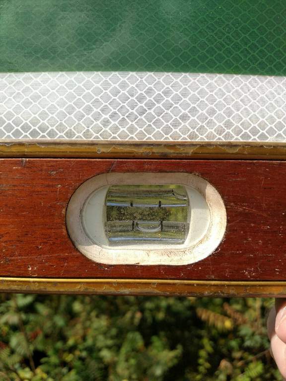
Because I have this kind of time....
In the photo it is clear the sign is not perfectly level. Close but not what I would find OK with a structure this size. Correcting that would require quite a bit of movement at the top of the sign.
It is plumb however.
 Greg
Greg 
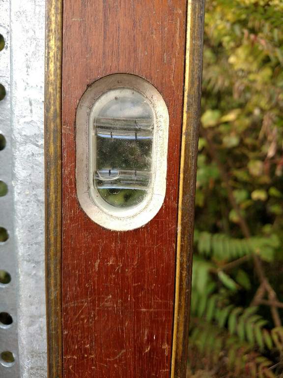
The small metal sign to the right when facing the sign is way out of plumb. This only helps to exaggerate the new sign levelness issue.
I'm beginning to think I live in a town with people that are a little off. First the saving of the damn goose, now this freak out with a level checking signs? Seriously? Does anyone work or have hobbies?
 Luca
Luca  Whip
Whip I have always said Allamuchy is a bit out of kilter, a half bubble off plumb, has lost their horizontal hold, as crooked as a cross-eyed cowboy, lets the cheese slide off the cracker, so crooked that if it swallowed a nail it would spit up a corkscrew, crooked as a dog's hind leg, a barrel of fish hooks and so on and so on....
"commercially acceptable" LOL. I like it.
LJRubi- This freak as you called me chooses to do what ever the hell I want with my time! Call it work, call it a hobby. Believe me I couldn't care less what others think. As Eric Burdon sang-"It's my life and I'll do what I want. It's my mind and I'll think what I want"
As far as checking level on the sign, folks were curious and without physically putting a level on it, we wouldn't know the facts. Now we do.
 BC
BC  eapos
eapos Actually I did not eapos. I could not get far enough back to capture the true feeling of out of whackness. LOL. I parked down the street and walked up behind the guard rail. The best photo would be from sitting at the light across 517.
 ASK
ASK  rleaf
rleaf Additionally these signs have advertisements on them for Centenary University-which isn't even in Allamuchy , Panther Valley-which is a private corporation and Rutherford Hall- which isn't owned by the township but rather the BOE-another Allamuchy debacle. I hope that my taxpayer dollars didn't give these businesses free advertising space. And wether they paid for the space or not, who chose them to be represented on the signs and were all other Allamuchy businesses asked if they wanted to be on it as well.
 Happy man
 It's for the goose.......
"There was a crooked man, and he walked a crooked mile,
He found a crooked sixpence against a crooked stile;
He bought a crooked cat which caught a crooked mouse,
And they all lived together in a little crooked house."
Mother Goose that is.
I'm going to ask the town clerk how the sign was paid for to put some of this forum to rest.
If it's crooked, maybe it's just a true sign of the times!
As for the non-Allamuchy references, they are simply to direct people to sites that are not easy to find off of exit 19.
Thanks to Greg for giving us the level scoop on the sign. It's now clear to me that the only fix is to redo the road so it is level, using the new sign as a reference.
 B1rd1e
 Again iRun why are my taxes paying for signage to promote businesses, unless they businesses paid for there own signs. And who was the arbitrator of who got to advertise on these signs, were all businesses asked or just some. I’d hate e yo imagine that if I owned a business in this community I’d sure like to have that exposure. And finally Centenary University isn’t even in Allamuchy it’s two towns away.
^ If you really think directional signs to nearby places are advertising, you have deeper issues to be concerned about than the Allamuchy sign.
 D-ManPV
 The signs are directing people to businesses, PV is a private EXCLUSIONARY corporation, Centenary University is a for profit institution and Rutherford hall is not owned by the town but by the BOE, by the tenor of your post it is clear that you don’t own a business but rather draw a paycheck from someone. Or I guess you are a psychologist since you are diagnosing people.
So glad I am not the only one! This sign is making me absolutely nuts every time I get off of Route 80..
 JrzyGirl88
  gwtwqueenie
Thank you Greg for taking the time to look into that! Surely confirmed my curiosity.
 cmg
cmg Not totally crooked. A lot of factors here tyebroad is going down hill and the arm on the light is going up hill at less of an angle. You also have the Hospital sign set off level to the right. look at the 517 sign hanging from light arm. It's level same as the new sign. Proper was to have installed it would have been to stand back 100' and see how it looked to the eye but then again people would be starting a thread that it's not level.
Does anyone really think it should have been installed parallel to the curb/guide rail? That's ridiculous. I think the main problem is that the Hospital/No Pedestrians sign is crooked. If the top of it were pushed to the left so that it were plumb, then the other sign would look fine.
 ianimal
 Lou: how about "was the camera on the level?" We have all parked there so we know Lucacell was not "on the level." I mean was Lucacell a straight shooter?" Could they be "off the beam?" :>) :>)
"Proper was to have installed it would have been to stand back 100' and see how it looked to the eye but then again people would be starting a thread that it's not level."
Gosh darned PC world..... It's all about the optics :>)
Having lived in many an older home, toss those levels away; when faced with multiple points off the bubble, it IS all about the optics. Lou +1
 stephen
 And 142 on pizza:)
As I stated previously - I'm pretty sure our tax dollars have paid for that sign so that is why I was curious and made my original post.
 Emosewa
 Stanger's law: the simpler the topic, the more "experts" appear on the scene.
LMFAO is this really a discussion?
It's a optical illusion because the other sign is so far off.
Even looking at greg's level....Greg, man you got too much time on your hands...but whatever, even looking at the level I would say it is acceptable.
 Darrin
 OK December 14th... the haybales, dead mums and rotten frozen pumpkins need to go....
 4catmom
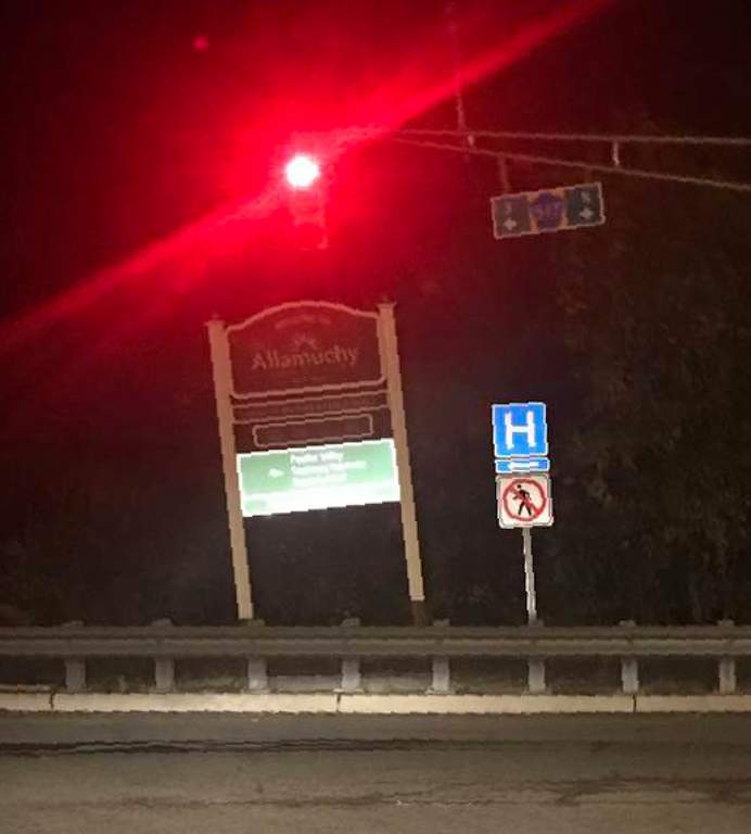
 ed
ed I saw the dead fall decor the other day and thought to myself that if you’re not going to maintain it why bother
 Nosila
 Seriously - I couldn't believe they had all those dead fall decorations up there. I thought I was the only one thinking the same thing - why bother if you don't keep it up? Nice to know I'm not alone!
The actual sign itself looks nice. I'd be more concerned about the wrong sized PVC post sleeves. The sleeves are supposed to cover the whole wooden post, not just 80% of it. The exposed wooden posts at the bottom of the sign looks ridiculous to me. They clearly didn't purchase the correct size sleeves, or they didn't sink the wooden posts to the correct depth. They should've used 12 ft PVC sleeves and cut off the excess. Other than that, they look nice to me.
Okay can we just re visit why the town hasnt painted these ridiculous loooing signs?? Who put these up thinking it looked normal? Just paint the wood and it would look fine!
Signed Hackettstown resident with spectacular looking welcome sign.
 Extra
Extra Greg nailed it!- but while he was there, why didn't he fix the sign that was out of plumb?! Every time I'm sitting in traffic, that's just an annoying set up to look at.
 Lili
Lili Probably put up by the 85 yr. Old Road Supervisor that the township still pays to do nothing except put up crooked signs!
 Monjie
 Anyone notice the lattice the added to the bottom of the sign? Makes it look even worse!
The sign is crooked !! Really??!!! Is this Life Changing? I do think there are Bigger issues and problems in our World. Don't you think people? Peace Love and Happiness
 LittleRascal
 Sort of like the clothing bin at Weis right Little Rascal..? Doesn't really change your life, but still kind of annoying..
The sign at the light is not crooked. The ground is a slope. It's an illusion. Bet if you put a level on the sign it's straight.
 Metsman
 It is straight. Greg went out there last October and put a level on it. LOL
Scroll up near the beginning of this thread for his pictures.
Why did all this "crooked" talk make me think of Hillary Clinton? I like the sign on Route 22 that says, Clinton KEEP LEFT. That's my favorite :-D
 Andy Loigu
 I don't usually go near that sign, but we came off Rt. 80 over there yesterday and honestly, the sign doesn't look crooked. It's on a slope. :shrug:
Geeez Andy, you too.....kick a dog when its down why don't you :>) All I can say is "Game on Tiny...."
When you go old, you learn the term "optically level."
The sign is level, but not optically level. And I don't know if it ever could be optically level given you have to adjust between the hill, the trees, the other signs, and the traffic light --- most of which are not level, some by nature, some by man :>)
The lattice just adds more reference points so, for some, makes it worse, and others, perhaps better.
Its a very nice sign, think I am ready to leave it at that. Because I am sure if they went to the trouble to make all of it perfect, the next day a car would miss the stop and take it all out. Perhaps better to leave the Karma where it is :>)
Have no fear, strangerdanger, just because I poked some fun at Hillary, I'm not swinging over to the side of fascism. Things have just been too stormy over there in DC. The state of "affairs" in the White House is not good, can't support it.
Commenting is no longer available.